

If you’re a marketing or communications manager, you understand the importance of an annual report. Not only is it a critical tool for communicating your organisation’s financial performance, growth, and milestones, but it also serves as an opportunity to reinforce your brand identity and engage with your audience on a deeper level. However, presenting data creatively is often where the challenge lies.
Annual reports are typically filled with numbers, figures, and complex data that can overwhelm readers if not presented clearly and engagingly. That’s why interpreting data creatively in your annual report is key to making it more accessible, memorable, and impactful. In this article, we’ll explore how you can creatively interpret and present data to transform your annual report from a dry collection of statistics into a visually appealing and compelling narrative.

The Importance of Data in Annual Reports
Annual reports serve as one of the most vital documents for any organisation, offering an overview of the previous year’s performance and outlining goals for the future. Financial data, key performance indicators (KPIs), and other important statistics make up a significant portion of the report. These figures are essential for understanding a company’s performance, but when presented poorly, they can be difficult to digest or leave a negative impression on stakeholders.
As marketing and communications managers, it’s your responsibility to ensure that these complex datasets are accessible, informative, and engaging. The challenge is interpreting the data in a way that is not only easy to understand but also visually appealing and aligned with the company’s overall branding.
Creative data interpretation allows you to take raw statistics and transform them into compelling visuals that capture the attention of your audience, making the information not only more understandable but also more memorable.
Why Creativity Matters in Data Interpretation
Data is often perceived as dry or impersonal, but creativity is key to bringing it to life. Creative interpretation can make your data more engaging and easier for readers to digest. It also allows you to showcase the narrative behind the numbers—helping to highlight key achievements, trends, and insights in a way that resonates with your audience.
Here are some key reasons why creativity in data interpretation is important:
- Increases Engagement: Well-presented data is more likely to catch the reader’s eye, increasing the chances that they will read and understand it.
- Enhances Understanding: Creative visuals can simplify complex data, making it easier for stakeholders to grasp key points without feeling overwhelmed.
- Supports Brand Storytelling: By interpreting data in creative ways, you can weave the numbers into a broader narrative that supports your brand’s mission and goals.
- Makes the Report More Memorable: A visually appealing and well-executed annual report is likely to leave a lasting impression on your stakeholders.

Common Challenges in Presenting Data
Even though data is an essential part of an annual report, it can be tricky to present effectively. Common challenges in presenting data include:
- Overloading the Reader: Too many numbers or charts can overwhelm your audience. If the data isn’t filtered or focused, it can make the report seem cluttered.
- Lack of Context: Data without context can be confusing. Without a clear narrative or explanation, figures may not make sense to the reader, who might not be familiar with the details.
- Dull Presentation: Using the same colour palette, layout, or style across the entire report can make the data feel monotonous. Without creative elements, readers may lose interest.
- Inconsistent Formatting: Inconsistent data formats—such as fluctuating font sizes or confusing graph styles—can make it difficult for readers to compare different sets of data.
These challenges can easily be avoided with the right approach to creative data interpretation, making your annual report more accessible and impactful.
Creative Techniques for Interpreting Data
Use Infographics to Simplify Complex Data
Infographics are one of the most effective ways to present complex data in a simple and engaging format. By combining text, images, and charts, infographics can communicate a lot of information in a compact, digestible format.
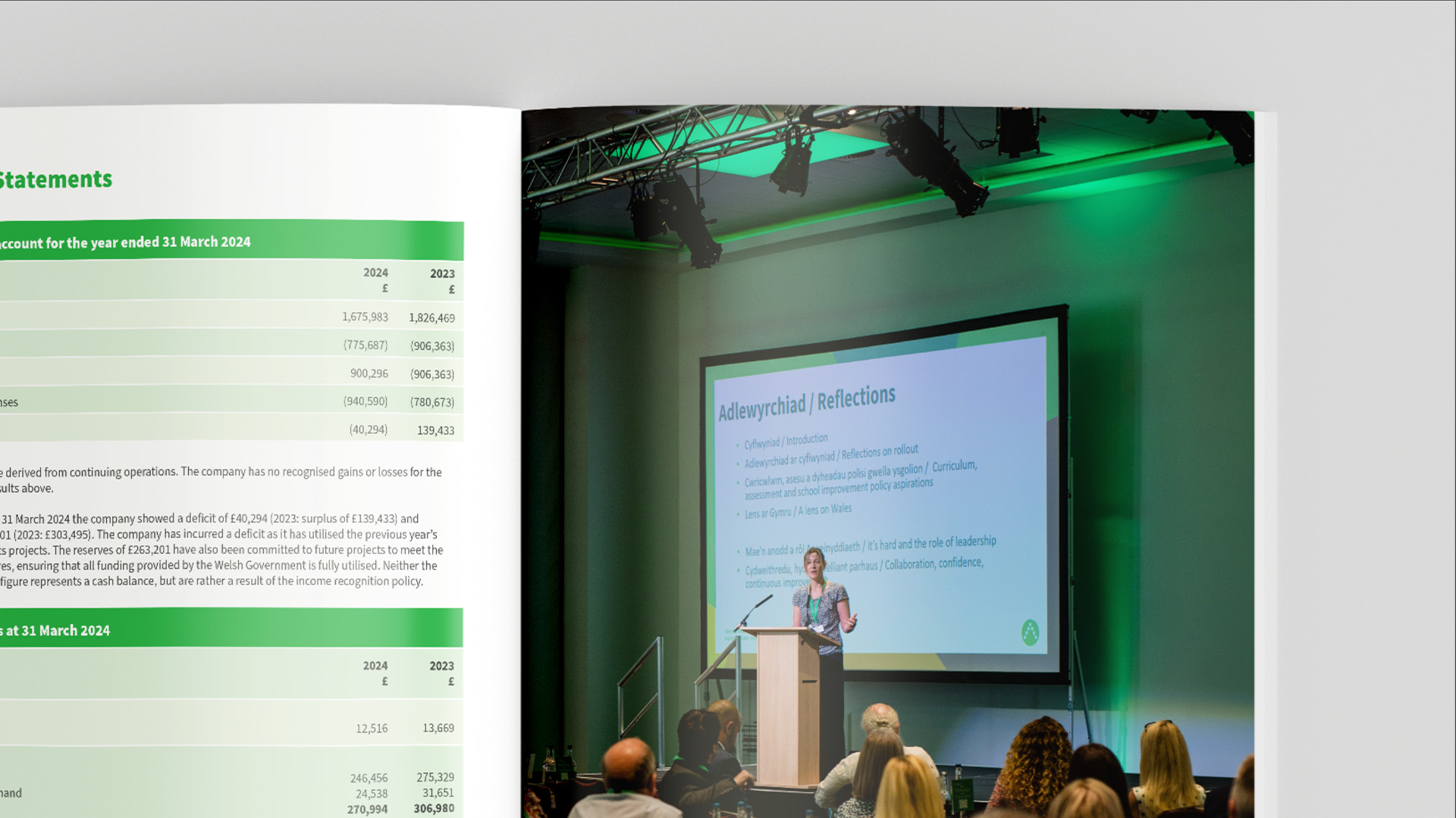
How to Use Infographics Effectively:
- Break down key statistics into bite-sized pieces.
- Use icons and symbols to represent data points.
- Incorporate colour coding to group related data.
- Keep text to a minimum, focusing on the visuals.
Infographics can turn a dense, numerical section of your report into something visually striking and easy to understand.
Create Visual Comparisons with Graphs and Charts
Graphs and charts are common tools for representing data, but you can take them to the next level by using more creative designs. Instead of the traditional bar charts and pie charts, consider using alternative formats like:
- Heat maps: Great for visualising trends over time or across different regions.
- Bubble charts: These provide additional data layers, such as size, which can help show comparisons more effectively.
- Timelines: Perfect for showing the evolution of certain data points or milestones.
Using these visual tools allows you to highlight key trends and comparisons in an engaging way, helping your audience grasp the insights more easily.
Integrate Data with Storytelling
One of the best ways to make your data more engaging is to tie it into a compelling narrative. Data storytelling allows you to present the raw numbers within the context of the company’s journey and future direction.
Key Tips for Data Storytelling:
- Begin with a compelling introduction that sets the stage.
- Use the data to support key points in your story, whether that’s demonstrating growth, overcoming challenges, or reaching new milestones.
- Use visuals and interactive elements to enhance the story and engage your audience.
By combining data with storytelling, you create a narrative that is both informative and emotionally engaging, making it easier for your audience to connect with the report.
Include Interactive Elements
Interactive elements are an increasingly popular way to present data in digital annual reports. Incorporating interactive features such as clickable charts, interactive infographics, and hover-over text can make the data more dynamic and engaging.
How to Incorporate Interactive Features:
- Include data that changes when clicked, showing different layers of information or trends over time.
- Add hover-over features that provide extra context or data points when readers interact with specific sections.
- Allow readers to filter or adjust data to view different segments.
Interactive features provide a more engaging experience, especially for digital annual reports, and encourage readers to explore the data more thoroughly.
Working with Alliance Agency: Our Approach to Creative Data Interpretation
At Alliance Agency, we specialise in helping organisations transform their annual reports into powerful marketing tools by creatively interpreting their data. Here’s how we approach data interpretation for annual reports:
- Collaboration: We start by understanding your business, the key data points you want to highlight, and your overall goals for the report.
- Creative Strategy: Our team of designers and content creators develop a strategy for presenting your data in an engaging and easy-to-understand format.
- Visual Design: We create custom infographics, charts, and layouts that complement your data, making it both visually appealing and informative.
- Storytelling: We help craft a narrative around your data, turning raw numbers into a story that captures the essence of your organisation’s achievements and goals.
- Interactive Elements: For digital reports, we incorporate interactive features that allow readers to engage with the data in a more dynamic way.
By partnering with us, you can ensure that your annual report not only provides key insights but does so in a way that keeps your audience engaged and impressed.
Enhancing Engagement with Creative Data
Interpreting data creatively in your annual report is not just about making it look good—it’s about making the information accessible, engaging, and memorable. By using techniques such as infographics, alternative graphs, storytelling, and interactive elements, you can transform complex statistics into a compelling narrative that speaks directly to your audience.
As marketing and communications managers, it’s your responsibility to make your organisation’s data shine. At Alliance Agency, we specialise in interpreting data creatively to help organisations produce annual reports that are not only informative but also impactful. If you’re ready to take your annual report to the next level, contact us today to find out how we can help you present your data in the most engaging and creative way possible.
